
Reports
Reports turn the data GridNMS collects every day into something you can hand to a manager, attach to an audit, or use to plan capacity. Each report can be filtered by time range and exported, so you can pull a clean snapshot whenever you need one.
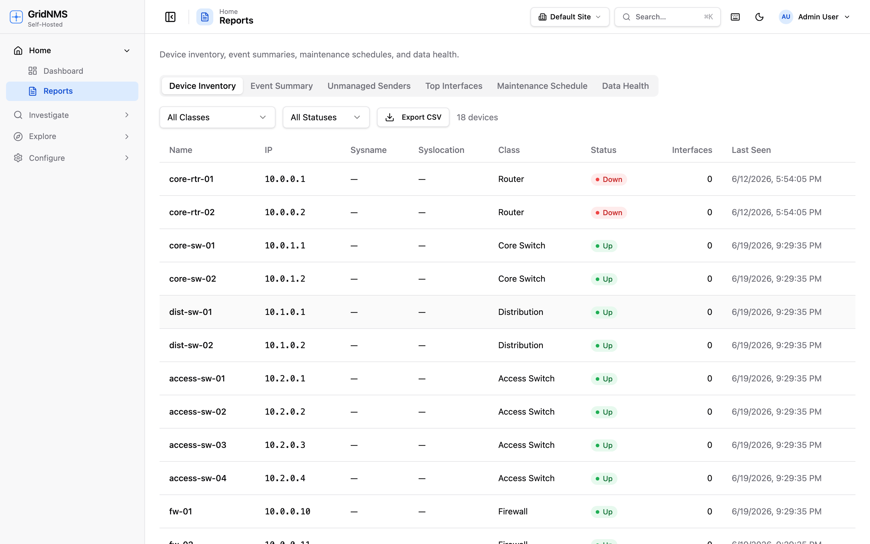 The Reports page generates inventory, event-summary, and maintenance reports you can filter and export.
Available reports
Section titled “Available reports”Open Reports from the navigation and choose the report you want.
Availability / SLA report
Section titled “Availability / SLA report”The monthly uptime report a manager asks for. It shows the uptime percentage for every device over a window — last 24 hours, last 7 days, or last 30 days — and sorts the list worst-first, so the devices that hurt your numbers are right at the top.
Each row shows:
- Uptime % over the selected window
- Total downtime in that window
- The number of incidents (how many separate times the device went unreachable)
- The longest single outage
Uptime is measured from the time a device was unreachable, compared against the full window — so a device that was down for 7 hours out of a 7-day window reports the matching uptime percentage. Devices that were healthy the whole window sit at 100%.
Use the class filter to narrow the report to a device type — for example, just Routers or just Firewalls. Filtering by a parent class includes its child classes, so scoping to “Network Devices” pulls in every switch, router, and firewall under it.
Export the report to CSV for the monthly SLA package or to share with a stakeholder.
Device inventory report
Section titled “Device inventory report”A complete list of the devices GridNMS is tracking, with the details you’d want for an asset record:
- Device name and IP address
- Class (Router, Switch, Firewall, etc.)
- Site / location
- Vendor and model where known
- Current status and last seen time
This is your go-to for audits and asset reconciliation — proof of exactly what’s on the network and where. Export it to CSV to drop into a spreadsheet, a CMDB, or an audit package.
Event summary report
Section titled “Event summary report”A roll-up of event activity over a period, designed to answer “how healthy were we, and what hurt us most?” It includes:
- A severity breakdown — how many Critical, Major, Minor, Warning, and Info events occurred (see severity levels).
- The top-10 event sources — the devices that generated the most events.
- The top affected devices — where to focus reliability work.
Use this for monthly reviews and post-incident reporting. The top-10 lists make problem devices impossible to miss — they’re often the best candidates for repair or replacement.
Maintenance schedule report
Section titled “Maintenance schedule report”A view of planned maintenance windows — past, current, and upcoming — showing:
- The time window for each piece of planned work
- The devices (or site/class) it covers
- Its current state (upcoming, in progress, completed)
- How many events were suppressed during the window
The suppressed count shows how many events would have alerted during the maintenance work but were held back — the events are still recorded, they’re just not alerted on while the window is active. This ties back to maintenance windows: it’s the proof that a window did its job and kept expected work from paging anyone.
Use this to communicate planned downtime to stakeholders and to keep a record of when work was done against which devices.
Log summary report
Section titled “Log summary report”A quick “what’s noisy?” view of total log volume over a window. It shows:
- Total log volume for the period
- A breakdown by severity — how much of the volume is Critical vs. Info, and everything in between
- The top sources — the devices and systems sending the most logs
Use this to spot a device that’s suddenly flooding logs, to size retention, or to find where the noise is coming from before it buries something important.
Top interfaces report
Section titled “Top interfaces report”The busiest interfaces across your network, ranked by throughput — the quick answer to “where’s the traffic?” Expand any row to see the actual throughput graph for that interface, so you can tell a steady heavy link from a short spike without leaving the report.
Filtering by time range
Section titled “Filtering by time range”Most reports accept a time range. Use the picker to set the window the report covers — last 7 days, last month, last quarter, or a custom span. The availability, event summary, log summary, and maintenance reports change with the range; the inventory report is a current snapshot but can be scoped by site. The availability report uses fixed windows — last 24 hours, 7 days, or 30 days.
Exporting
Section titled “Exporting”When a report is on screen, use the Export option to download it. The availability / SLA and device inventory reports export to CSV, which opens cleanly in any spreadsheet tool and is easy to import into other systems. CSV export makes reports portable for:
- Audits — a timestamped, shareable record of inventory or events.
- Capacity reviews — feeding device and event data into your own analysis.
- Handoffs — giving another team a snapshot without GridNMS access.
Common ways teams use reports
Section titled “Common ways teams use reports”| Goal | Report | How |
|---|---|---|
| Hand a manager a monthly uptime number | Availability / SLA | Run for last 30 days, export CSV. |
| Find the least-available devices | Availability / SLA | Read the worst-first list up top. |
| Prove what’s on the network for an audit | Device inventory | Scope to a site, export CSV. |
| Spot the least-reliable devices | Event summary | Run for last month, read the top-10. |
| See what’s flooding the logs | Log summary | Run for the window, read the top sources. |
| Show planned downtime to stakeholders | Maintenance schedule | Filter to upcoming windows. |
| Confirm a maintenance window suppressed the right alerts | Maintenance schedule | Check the suppressed-events count on the window. |
| Find the busiest links | Top interfaces | Sort by throughput, expand a row for its graph. |
| Track event volume trend over time | Event summary | Run for each month and compare severity breakdowns. |
| Feed asset data into a CMDB | Device inventory | Export CSV and import. |
Where to go next
Section titled “Where to go next”- Drill into the underlying records on the Events & Alerts page.
- Keep your inventory accurate so reports are accurate via Devices & Inventory.
- Plan downtime that shows up in the maintenance report from Events & Alerts.